Social Navigation Platform


Relative Media


Problem to Solve
Solution
Ticket Display
To solve for the ticket display, I opted to use tables as tested and validated by the end-user. As social navigators, their work is often toggling views and screens without wanting to jump pages or program windows. Nor did they want to scroll too often. This presented the challenge of both accessibility and responsive design.
Collapsing cells into multi-line text, providing "chips" for status displays, and stacking the fields for responsive displays on shorter desktop monitors seemed to fit the UI snugly. Adding a "searching everything all at once" field also helped the navigators jump to content that mattered most. We also opted to separate the tables by tabs related to open tickets, closed tickets, and an option for duplicate profile tickets that came in a later phase.
Profile View
The profile view was an opportunity to deliver a true CRM launchpad of action items. We enabled the navigator the option to edit the client's profile and view the edit history. Open new tickets based on the programs available to them based on demographics. As well as see any tickets that already exist for this client.
Opting to use a card horizontal card display in a flex-box format enabled us to build the program list with room for future grown, as requested by the navigator team. Beyond the pilot MVP, the intention is that there will be multiple program options for food assistance, transportation, and a few other upcoming categories.
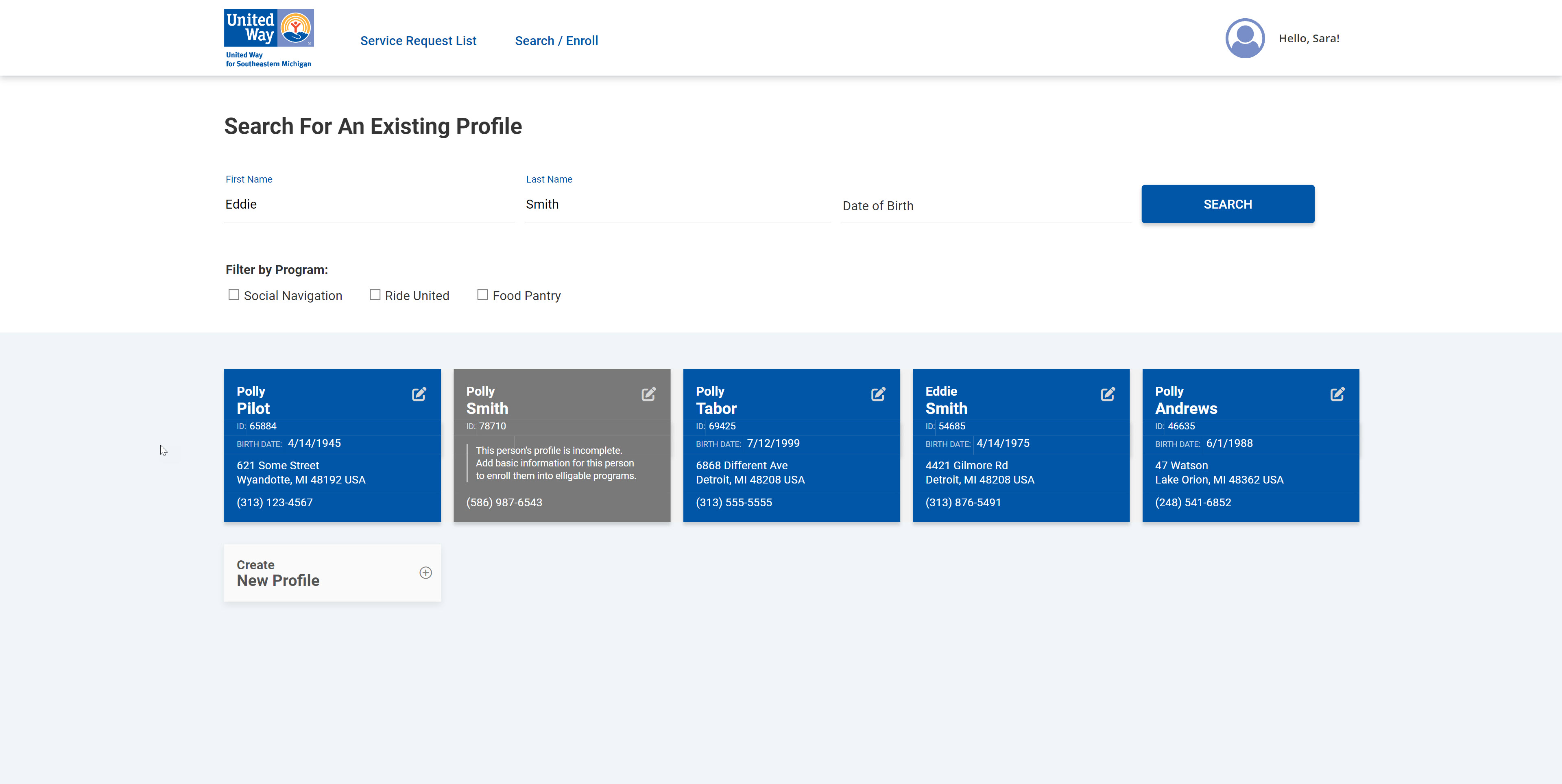
Profile Search
We found that in the user-flow for the Navigator team, users should pass thru a search prior to creating and working on existing tickets to ensure that we could keep the database clean of duplicate profiles and tickets. So this screen only felt natural to allow searching parameters on exact match, and like-match results. Furthermore, giving the option to filter by a category of which program the client was enrolled would help ensure they are about to perform action on the correct client. If no client existed, they can simple create a new profile.
Using the repeating horizontal card display consistently proved to be the most adorned by the navigator team. The physical aspect of the card display in flex-box format provide a sense of "best-to-least" closest match confidence when selecting a client.
Profile Duplicate
In the off chance there was a duplicate profile, the Navigator team would be presented with an automated response form the platform. Letting the end-user know that a third party API called Verato was identifying a possible duplicate profile created.
I was presented with the challenge to allow the navigator to provide human intervention and speak to the client about which set of profile information was accurate to identify if this was a match, or if it truly was a different individual.
Providing a side-by-side display of the existing profile on file with the one that was just created, allows a direct correspondence that highlights the differences on the same eye level. If the profiles are the same person, the end-user simply updates the existing profile on this screen and saves the progress. If the duplicate is identified as a new client, they can select an option that ignores this flag, and simply keeps both profiles.